I’m going to veer off the WiFi trail for a bit here and talk about presentation software that’s used predominantly in the House of Worship space, but also increasingly in corporate production.
(Featured Image from Church Motion Graphics‘ excellent article, 10 Essential Rules For Projecting Lyrics)
The Contenders
Renewed Vision: ProPresenter v6
- $399 Single (Mac OR Windows)
- $799 Campus (HoW only, both Mac AND Windows)
- Indefinite watermarked demo
- 30-day trial
- Available in the Free Range Tool Shop
MediaComplete: MediaShout v6
- $399 Single (Mac OR Windows)
- $499 Site/Campus (Mac OR Windows)
- $649 Site/Campus (Mac AND Windows)
- 30-day trial
Back Story
As one might expect, the relative merits of MediaShout and ProPresenter, two of the leading worship presentation applications, are the subject of much debate among (and between) their respective user communities. ProPresenter is originally a Mac application, while MediaShout’s origin story hails from the Windows side. Both applications are now available on both Mac and Windows platforms, themselves also the subject of much debate among their respective user communities. Both applications enjoy a variety of features to make the graphics operator’s life easier, while offering a variety of advanced features as well.

I can already hear you asking, “But which one is ‘better’?” I absolutely despise this question about anything technical. You’re asking me for a subjective opinion without telling me first what matters to you, and what makes it “better” in your mind. I get this all the time in the WiFi world, and see the question on Quora on a daily basis. The answer to that question, regardless of what is being asked about, is always going to be “it depends”.
A Little History…

One of the fundamental features that has been the underpinning of MacOS since the very beginning in 1984 (and some might even argue that it even goes back to the Lisa), and which was eventually extended to NeXT, was type rendering. This is something that Apple has been intentionally excellent at from the start. Even the early Macs were designed with a display resolution of 72dpi, their dot matrix ImageWriter printer at 144dpi, and their LaserWriter printer at 288dpi – and most everything was vector based type with a few exceptions for fonts (such as Chicago) intended for display only, which were raster fonts for the simple reason of conserving processing power.
This led to the desktop publishing revolution that completely transformed typesetting and document layout in under a decade. Until about the late 1990s to the early 2000s, virtually all publishing was ultimately done on a Mac, until Windows-based tools started catching up. (I first ran PageMaker on Windows 2.0, and it was a terrifying experience, especially compared to the beauty of running Adobe Illustrator 2.5 and Quark on a Mac IIfx just a few years later).

It was also in the mid-1990s that color data projectors started becoming somewhat affordable, and eventually displaced the overhead projector in meeting rooms everywhere. Some of us old-timers remember what needed to be done for full color slides before that: Either expensive color laser printing (yes, that was actually a thing even in the late 1980s) onto overhead transparencies, or if you were particularly flush for cash, you would mail out a Zip or Jaz drive (this was before the Internet, after all) to a company that would make actual 35mm slides from your presentation. Anyone remember Harvard Graphics? Around the late 1980s, a new player entered on the scene, originally (and ironically) for Mac: an application called PowerPoint. It was purpose built for making these overheads and 35mm slides. It was so good that Microsoft made PowerPoint its first major acquisition and rolled it into their Office suite (and it was still Mac-only until 1990). Today, Microsoft has changed – they’re platform-neutral, and embrace the Apple ecosystem (most people on the Microsoft campus wield iPhones these days!)

Meanwhile, many churches had started using overhead projectors in place of hymnals or other printed songbooks. This allowed them to use newer songs outside the normal book publishing cycle (which was long then, and is still long today – the United Methodist Church hasn’t updated its core hymnal since 1989, and is currently updating it to a digital-only format, 30 years later). Naturally, using overhead projectors was pretty unwieldy, and only suited to smaller spaces.
By the late 1990s, digital projectors started becoming more readily available (but still weren’t cheap), and in corporate boardrooms and military briefings everywhere, we saw the opening salvos of Death By PowerPoint, when managers realized they could add fancy imagery to their presentations without spending an arm and a leg. Mirroring the secular world, many churches had made the jump to projectors and PowerPoint, doing basic lyrics on screens within the processing capabilities of the computers of the time. Some started using visual imagery to (usually) complement the lyrics or the overall theme of the worship service.
But PowerPoint wasn’t the easiest thing to use when dealing with the somewhat unpredictable nature of worship leaders feeling led by the Holy Spirit to do that verse again, or maybe throw in a bridge, or in some cases, jump into another song entirely, leaving the graphics operator wondering where to go next (one church where I volunteered had their entire worship song repertoire in a single PowerPoint file, and a printed index by title and first line, with the slide number for that song, which could be keyed in on the number pad for direct access). Thus was born worship presentation software. As was typically the case with computer applications in those days, the user interface was still a little clunky, as everyone scrambled to bring products to a brand new market. Many have come, Many have gone, and some still remain today.

A projector in those days was typically 800×600 unless you were ready to shell out some big bucks for one that was 1024×768. If you went past 1000 lumens, you were getting a BEAST. The idea of multiple displays on a computer was also a very new concept, requiring some serious display processing horsepower. But this ushered in the ability to have one screen controlling, one screen doing output, and eventually we got to multiple output screens and edge blending and stage displays and LED walls and environmental projection and all kinds of crazy stuff.
Back to the Present
So after a few decades of evolution and innovation, we now have a mature product market, and virtually every church is using presentation software and a screen to some degree. Macs still have a solid grip on the visual arts market, although many of the applications now run on Windows with virtually identical interfaces… So what’s the difference?
First I’m going to show you some comparisons of the output between the same application on each platform.
I used three slides from our worship this week (two title slides and one lyric slide) , and on the lyric slide, showed the 4 basic type “decorations”: plain, border, shadow, and border+shadow. Border was set to 1 pixel, shadow was a distance of 3 and a spread of 3 at a 135° angle to the right of top. Output set to 1920×1080 native on all four platforms.

MediaShout v6
These were generated by creating the MediaShout script in Windows and packing it, importing on the Mac. Also had to make sure the proper fonts (Quicksand and PT Sans Narrow Bold) were installed on both machines. Background Graphics are from Shift Worship‘s Graduation Collection
Title Slide (with Bold Text)


Title Slide (Regular Weight)


Lyric Slide (Plain)

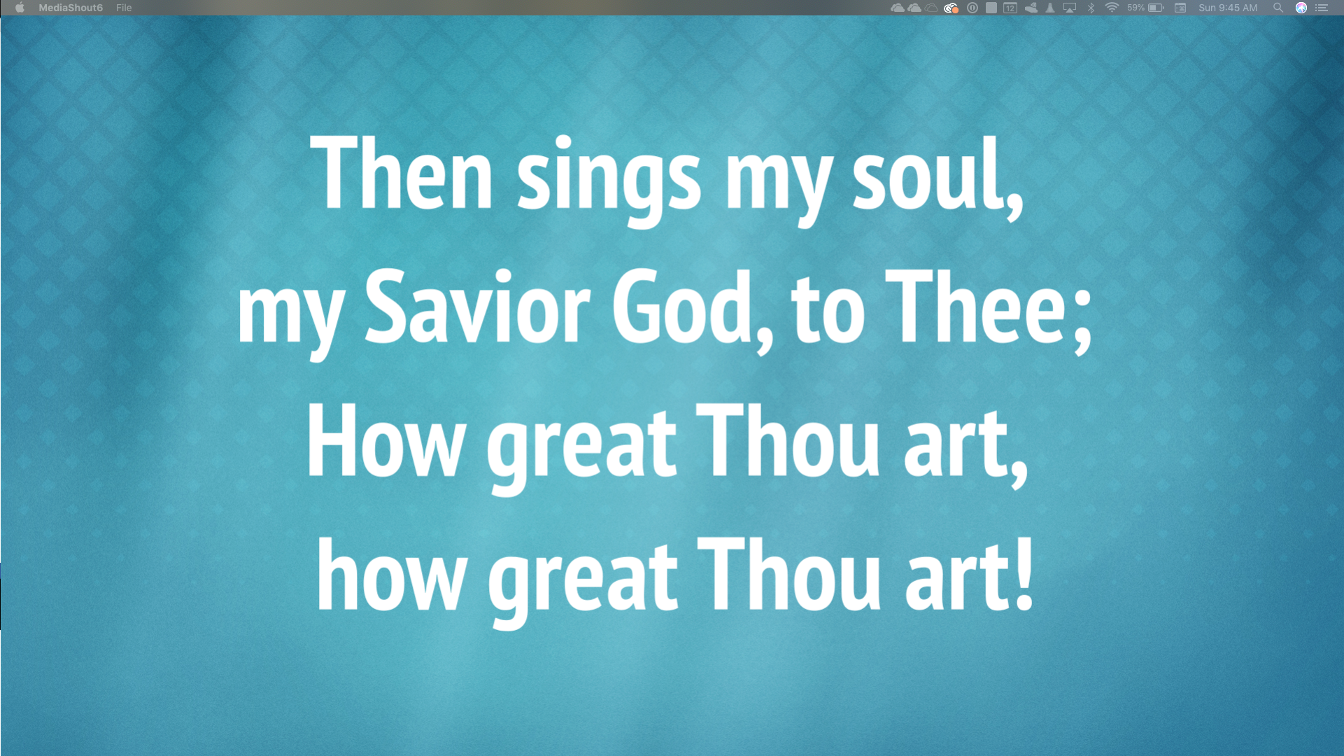
Lyric Slide (Outline)


Lyric Slide (Shadow)


Lyric Slide (Shadow + Outline)


Observations: We can already see where Windows doesn’t do type as well as Mac. Both in terms of rendering outlines, but also in type weight and kerning. Both Machines use the exact same OpenType font files.

ProPresenter v6
These were generated by creating the ProPresenter Slides on Mac, exporting to a bundle, importing on the Windows machine. Had to make a brief tweak to the song lyrics, because the Mac considers PT Sans Narrow a separate typeface, while Windows considers it a variant, and imported the match wrong, rendering it as Arial (something to consider when moving between Windows and Mac on ProPresenter). Watermark because for the purposes of this demonstration, loading up a full license wasn’t necessary.
Title Slide (Bold Text)


Title Slide (Regular Text)


Lyric Slide (Regular)


Lyric Slide (Outline)
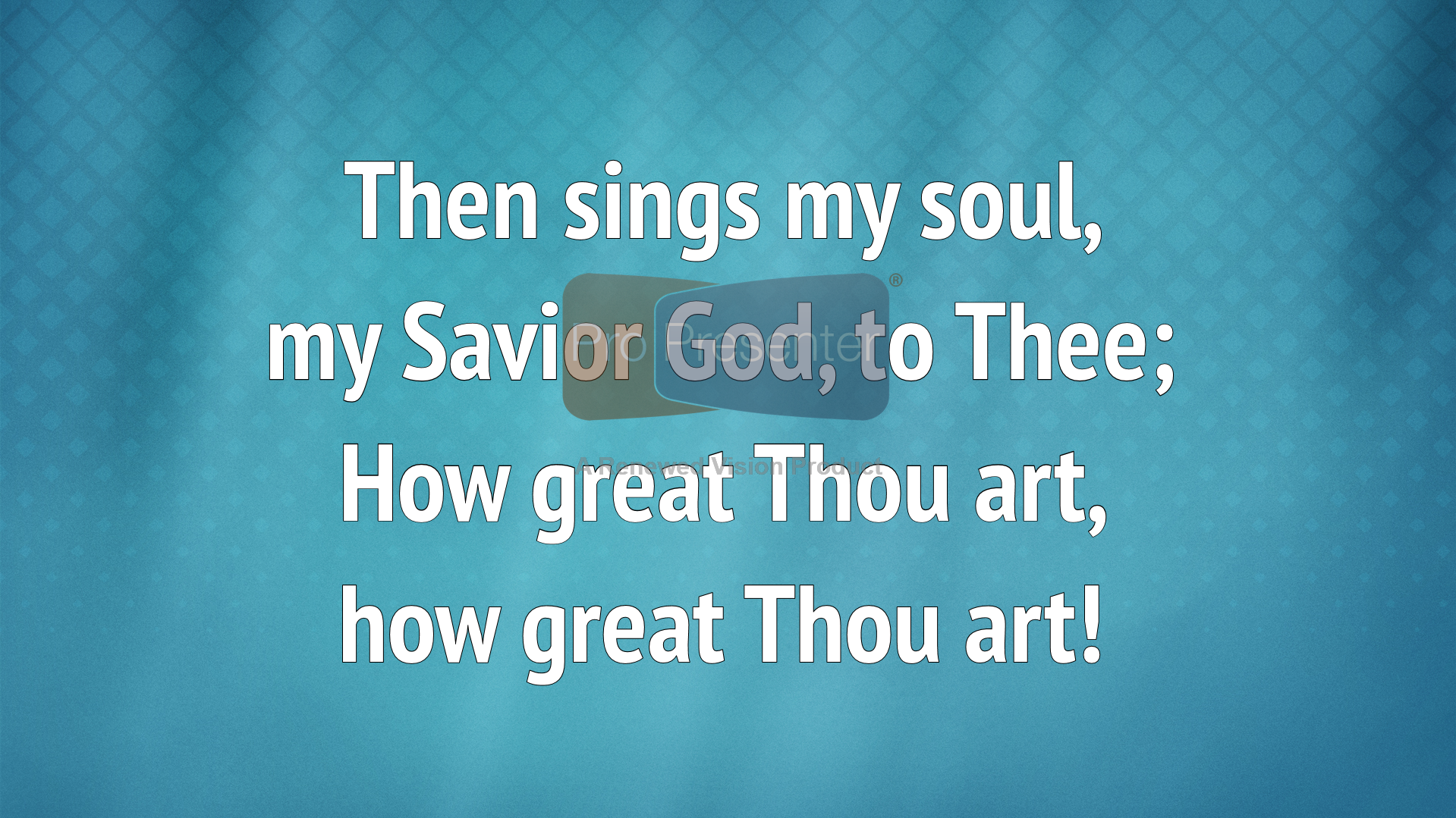

Lyric Slide (Shadow)
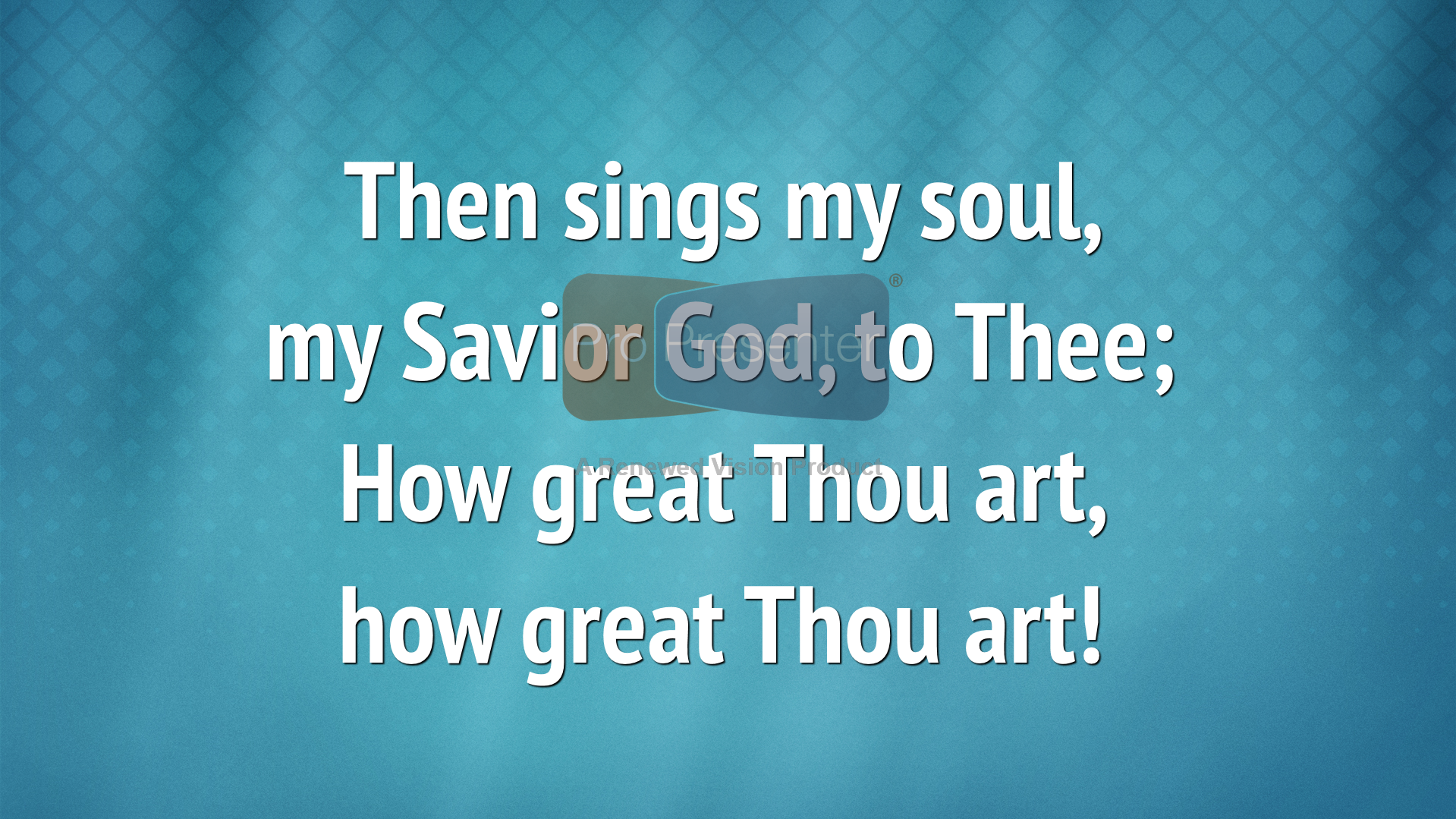

Lyric Slide (Shadow + Outline)


Observations: Here we see again some of the kerning differences between the platforms. They may seem minor, but text is one of those things where details matter. We also see that Windows’ outline and shadow algorithms still tend to overly emphasize the horizontal axis (something that is particularly visible in MediaShout on Windows). And interesting quirk is that the background image seems to have more contrast on the Windows side, regardless of application – this may be attributable to differences in the way the graphics card renders, or the color depth in the HDMI output signal.
Clash of the Titans
Here, I’ll compare two slides, between applications, first on Mac, then on Windows. The sizes differ here because there’s no good way to import from one to the other, and MediaShout’s type “size” number at 1920×1080 is about 1/3 that of ProPresenter’s (a “60” on MediaShout, which appears to use point sizes, is roughly a “180” on ProPresenter, which uses pixel sizes, so it will vary depending on your output resolution), so pasting from one to the other with formatting could lead to some interesting results.
Title Slide (Bold Text)


Title Slide (Regular Text)


Lyric Slide (Shadow + Outline)


The Lowdown
Which one ultimately works for you will largely depend on your specific workflow and requirements… Any of the 4 options will likely be an excellent choice. The Mac has noticeably better type rendering than Windows on either application. ProPresenter has a few odd user interface differences between the two platforms (mostly in terms of popup windows), whereas MediaShout’s UI is practically identical on both platforms, which makes user transition between hardware platforms seamless. MediaShout has a distinct advantage in offering features like multi-screen capabilities and bible translations as part of the core product (both are paid add-ons in ProPresenter). ProPresenter, on the other hand, offers a lot of external automation features using the communications module (Mac Only) as well as SDI and alpha key output (also Mac Only). Both offer remote control and stage display via an iOS app (although ProPresenter has much more flexibility on the stage display side with multiple layouts and an AppleTV app).
It’s worth mentioning that for performance reasons, MediaShout only recommends running your output at a max of 1280×720 and scaling accordingly – it can render internally at a different resolution than the output display. This is not a particularly good bit of advice from a graphics quality standpoint (ProPresenter will happily output at 1920×1080 on the same hardware). Ultimately, pick the native resolution of your highest quality output device and use an external scaler like a Decimator MD-HX.
Under the hood, MediaShout’s approach with using multiple Access databases is a little archaic (and only the lyrics database can be placed in a custom location). Thumbnail generation within the MediaShout control screen has been a persistent challenge, and the database approach tends to leave a lot of cruft behind. On the upside, if you’re feeling particularly adventurous, you can open it up in Access and clean things up. I personally much prefer ProPresenter’s approach to using separate files for each song (although their use of a proprietary file format rather than standard XML is a little annoying from an interoperability standpoint). ProPresenter’s approach lends itself better to shared cloud storage for multiple venues.
If you’re moving from one to the other, make sure you get cozy with the documentation, as each one has a fairly different approach to performing the same task. The transition can be maddening if you don’t. You’ll get to find the quirks of each platform and application fairly quickly.
Both products have excellent support, even on a Sunday when you need it the most, and are actively developed and maintained.

Leave a Reply